The Unintentional Masterpieces Hiding in Plain Sight on Public Signs
From hyper-specific warnings to legendary line-break disasters, miscrafted public notices are the best free entertainment on Earth.
Most public signs have one job: be completely, utterly forgettable. They exist to tell us where to stand, which door to push, or that parking is prohibited on the third Tuesday of the month between two in the morning and a very specific quarter hour. They are standard, functional, and engineered to blend into the background of our everyday routines.
And yet, every once in a while, typography breaks down, phrasing takes a wildly left turn, or someone designs a layout without stepping back to read it out loud. That is the exact moment a mundane public notice transforms into accidental comedy gold.
The Magic of the Misplaced Line Break
Designers know that layout and spacing matter, but the rest of us usually only realize how much it matters when a notice goes gloriously wrong. Awkward line breaks are responsible for some of the finest unintentional jokes visible on a morning commute.
Consider the classic layout trap where words intended to read across two side-by-side panels end up being read top-to-bottom instead. A friendly community notice can easily morph into a bizarre personal statement with just a slight shift in word placement. Or imagine a notice meant to say "Do Not Block Door," but because of unusual vertical spacing, it reads as a stark, existential command to simply "DO NOT DO." You cannot help but stand there for a second and ponder your life choices.
Suspiciously Specific Warnings
Then there are the notices that raise far more questions than they answer. Most public signboards give general guidance like caution regarding wet floors or minding a step. But every now and then, you encounter a rule so hyper-specific that you immediately want to know the backstory.
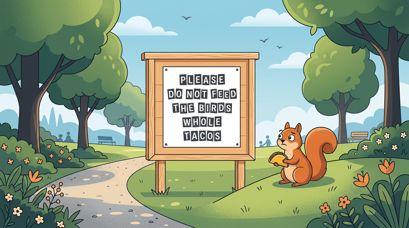
When a board at a public park explicitly asks visitors not to feed squirrels entire burritos, or a notice begs patrons to refrain from using a copy machine as a face mirror, you know an extraordinarily strange series of events took place right on that spot. The sign becomes a tiny, permanent monument to one human being's extremely unusual afternoon.
Lost in Phrasing and Translation
Awkward phrasing is not just a layout issue; it also happens when notices undergo literal translations or quick drafting without an editor. When functional instructions pass through literal phrase-matching software without a second glance, routine directions can take on a surprisingly poetic or dramatic tone. A simple notice meant to advise stepping carefully might suddenly invite passersby to "execute footsteps with deep caution and poise." It turns an ordinary errand into an unexpected theater exercise.
The Otterly Interesting Part
There is something genuinely charming about these tiny design hiccups. In a world full of polished graphics, hyper-curated feeds, and perfectly optimized communications, an absurd public notice feels wonderfully human. It is a tiny, harmless reminder that people made the world around us, and people occasionally mess up line breaks or choose strange words under a deadline.
Next time you are out running errands or taking a walk around your neighborhood, keep your eyes open. Somewhere nearby, a poorly spaced banner or an oddly phrased warning board is waiting to make your day just a little bit brighter. What is the most delightfully absurd sign layout you have ever spotted out in the wild?
Keep exploring
- He Joked About Double-Checking the Ultrasound—Then Fate Sent Triplets
- They Were Browsing a Random Yard Sale. Then She Found Her Husband’s 19-Year-Old Photo in a Bin.
- Portland Made Parallel Parking a Sport, Complete With Pool Noodle Bumpers
- Take an Otter quiz
Have something to add?
Join the conversation
Kind, funny and useful takes only — that's the otter way.
Loading comments…